The aim of this guide is to equip you with everything you need to make sure your emails not only look great across email clients, no matter the typography, but also the skills to choose a great set of fonts specifically tailored to the nuance of email and how to technically implement them in the code so your recipients get the font style you would like.
As any designer will tell you, the choice of font is as important as any other aspect of your brand’s design. A font can portray a lot about a brand. Plus there is a lot to think about - serif, sans-serif, ligatures, typeface, leading, kerning and much more should be taken into account - and I have covered them all below, as well as how these can be achieved in email.
Font attributes
You’ve chosen your typeface and have some ideas about the fonts, but what elements of a font can you control and how does this translate to email?
Font-size
The font size is the height of the uppercase X plus any descenders such as the bottom of the letter ‘p’ or ‘q’. The Web Consortium Accessibility Guidelines (WCAG), do not state a minimum font size, only content is resizable up to 200%. Best practice for email is that body copy (such as this paragraph) is 16px - and when working with brands and designers across industries, I have made this work for all designs. If you need a smaller font for terms and conditions, footer text etc. then the absolute minimum I would allow is 14px.
Font-style
The font style can be used to determine if a font is italic or oblique, if you have included a font that has an italic or oblique version, it will use that version. If you only have a ‘normal’ version, the italic or oblique style will be simulated.
Font-weight
The ‘weight’ of a font is how thick the lines of each letter are. The most common font-weights are:
Normal or 400
Bold or 700
But as long as the fonts you choose have the available font weights it can be anything from 100 - 900.
Kerning
Font kerning is the space between letters of the same word. Every font will have a default kerning, but this can be altered using CSS. Kerning in fonts is used to define how spaces between certain letters behave, for example the letters AV or AW will often be closer together, due to the vertical angle of the letters allowing them to almost overlap.
There is a specific CSS attribute - font-kerning which has good support across email clients.
However the more common way to create kerning is to use letter-spacing, which is supported across all email clients.
Leading
Pronounced ‘Ledding’ is the term given to the space between the lines of text. In email and web development we use CSS line-height to control this space.
A negative line-height is not supported well across email clients. Setting different line-heights for multiple fonts in multiple email clients is near-impossible - so setting a line-height that will work well with all of your font choices is important.
Accessibility callout
In the Web Consortium Accessibility Guidelines - WCAG. It states that line-height should be a minimum of 1.5 times the font-size. Therefore a font-size of 16px should have a minimum of 24px line-height to pass the success criterion 1.4.12 Text spacing.
Ligatures
Font ligatures are the technical name for two letters combining to create one shape- as shown below.
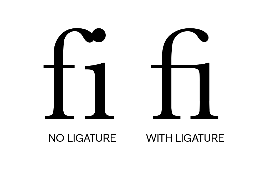
This feature of some fonts is not supported in email clients.
How many fonts?
The best practice agreed by designers is to choose no more than 3x different fonts per design - and email designers I have asked agreed that this keeps the email cohesive, but also allows enough variation to enhance the design and impact of fonts where needed.
Where can you find custom fonts?
MyFonts
Website: https://www.myfonts.com/
The #1 place to download great @font-face webfonts and desktop fonts: classics (Baskerville, Futura, Garamond) alongside hot new fonts.
Features 4.5k foundries selling more than 250k typefaces
Creative Market
Website: https://creativemarket.com/fonts
The world's largest marketplace for fonts with over 420,000 fonts and font families, all meticulously crafted by independent artists around the world.
Fontspring
Website: https://www.fontspring.com/
Worry-Free fonts with custom licensing options and fonts that cover common uses designers expect.
TypeType Foundry
Website: https://typetype.org/
Browse commercial fonts: buy fonts online for use in web, desktop and applications. Find thoroughly tested and perfectly optimized typefaces.
Monotype Fonts
Website: https://www.monotype.com/fonts
Access to over 250,000 fonts from more than 2000 type foundries with subscription-based licensing.
Hoefler & Co. (Typography.com)
Website: https://typography.com/
Famous for designing long-lived typefaces marked by high performance and high style, creates fonts for world's foremost institutions, publications, causes, and brands.
Adobe Fonts
Website: https://fonts.adobe.com/
Adobe Fonts partners with the world's leading type foundries to bring thousands of beautiful fonts to designers every day.
Commercial Type
Website: https://commercialtype.com/
Type foundry headed by Christian Schwartz and Paul Barnes, known for custom typefaces for major publications and corporations.
Emigre
Website: https://www.emigre.com/
Digital type foundry based in Berkeley, California, founded in 1984, among the early adaptors to Macintosh technology.
House Industries
Website: https://houseind.com/
One of the respected independent foundries that has collaborated with renowned type designers.
Google Fonts
Website: https://fonts.google.com/
Google Fonts has one of the most extensive free and open-source fonts. It is a reliable option for web developers and designers looking for high-quality, customizable typography for their designs. Unlike the other sites on this list, Google Fonts offers completely free fonts that can be used for both personal and commercial projects without any licensing fees.
Code
Now you have your typeface and figured out the designs in a design file - how do you get it to look how you want once it has been sent?
For any email coder out there, a huge number of factors will determine how your emails look in the inbox. In this next section I want to build up the knowledge of anyone trying to get their fonts looking great, being accessible and progressively enhancing the experience wherever possible. Before we look at email client fixes and all the work you are going to need to put in (🤣) we will start from the beginning, looking at semantic HTML, accessibility and styling before client specific fixes, dark mode and much more!
How do we set up fonts in email?
We’ve decided on the main font we would like in our email, how do we get that to show in our code?
The first thing to work out is if the font is already available on your recipients devices. Every device has pre-installed fonts that it will use to show content.
Tip: Sometimes this group of fonts are called ‘web-safe’ - this is an old web design saying, referring to fonts that are pre-installed, so they are safe to use on the web.
These vary by device, operating system and email client. There are some great resources that break down the fonts available per operating system:
Modern font stacks is a comprehensive site that shows the font ‘stacks’ you could choose to match the typeface you would like to include: https://modernfontstacks.com/
CSSfontstack is similar but a bit of an older site that can come in useful when trying to figure out what is possible on older devices or picking fonts that are the mainstay of operating systems: https://www.cssfontstack.com/
Email clients usually have access to the system fonts on a device, therefore a dedicated list isn’t needed - but as you will soon come to realise, there’s always an exception - Gmail has a set of fonts it uses and will show in place of the typeface:
- Google Sans
- Google Sans Medium
- Product Sans
- Roboto Italic
- Roboto Regular
- Roboto Medium
- Roboto Bold
If the font you have chosen is not one of the above in Gmail, or a common font already installed on a user’s device - how can you use it and where will it work?
Custom font support
As with everything in email, the use of custom fonts is not supported across all email clients.
| Email Client (Alphabetical order) |
Custom Font Support |
| 1&1 (Android) |
No |
| 1&1 (Desktop Webmail) |
Yes |
| AOL |
No |
| Apple Mail |
Yes |
| Fastmail |
No |
| Gmail |
No |
| GMX (Android) |
No |
| GMX (iOS) |
Yes |
| GMX (Desktop webmail - GMX.de) |
No |
| Hey |
Yes |
| LaPoste.net |
No |
| Mail.ru |
No |
| Orange |
No |
| Outlook (Windows Desktop) |
No |
| Outlook (All other devices) |
No |
| ProtonMail (Android) |
Yes |
| ProtonMail (Desktop Webmail and iOS) |
No |
| Samsung Mail |
Yes* |
| Thunderbird |
Yes |
| Web.de (iOS) |
Yes |
| Web.de (Android and Webmail) |
No |
| Yahoo |
No |
* When using a Microsoft email address, such as hotmail, outlook, live etc. the font will not work.
Getting your font file
Every font on your device is either pre-installed, for Microsoft this could be Times New Roman, for Mac Helvetica and on both, Arial. Alternatively when viewing a web page or looking at an email, the file containing all the information about the font can be downloaded and used - this is how we can get the font you have chosen to work in email.
You can find different fonts online or you can get a custom font created for your brand. It’s important when deciding to use a font in your emails that you check the copyright status and contract your brand signed when they purchased the font, some are only licensed for a single website, some for desktop apps and some have a blanket license for any commercial use, so it is a good idea to check.
If you did purchase a font, they will have been shared to use as a file. Like image files, font files come in different formats:
TTF - TrueType Fonts
This format was created by Apple to allow for better design quality and manageable file size. The file size is still quite large - therefore is not favoured for use on websites, but is supported across all major browsers.
OTF - OpenType Fonts
Microsoft and Adobe created this font format to cater for high end design software and desktop use. Therefore you have the most font features and highest quality graphics - however it comes with a larger file size, again, it is well supported across browsers, but not used commonly in web development or email.
WOFF/WOFF2 - Web Open Font Format
Created with input from Mozilla and managed by the W3C Web Consortium, this font file is specifically designed for the web, with compressed file sizes - but a compromise on some font features. This is the format most commonly used on the web and the one most developers would recommend for using in email.
WOFF2 is a smaller, more compressed version of WOFF - therefore perfectly suited to sending via email to your recipients.
Ideally you will have your font in woff2 format, if you do not, you can contact the creator of the font and ask if this is available. Alternatively, as long as you can legally do so, there are online conversion tools which you can use - Cloudconvert is a very common site for converting file types.
Similar to other files in your email, such as images, your font will need to be ‘hosted’ on a server so it can be linked. Generally your email fonts will be hosted on the same server as your website - so this is most commonly handled by your web development or IT team.
Alternatively services like Google Fonts and Adobe fonts will host their fonts on their servers and allow you to use their links.
Google fonts are free to use, you can search for the font you have chosen or look for one very similar.
Tip: If you are a European brand and you would like to use Google Fonts, there is a court case from Germany in 2022 where a web site was fined for a GDPR violation when using Google Fonts. There are GDPR safe alternatives such as Font Bunny which are GDPR compliant.
Adobe Fonts require a subscription to use and can be tied to a specific website or project with applicable pricing.
Wherever your font is hosted there is one important setting that needs to be taken into consideration, the Cross Origin Resource sharing (CORS). These are a set of rules or ‘headers’ that a web server will use to see if someone requesting your font file is allowed to do so. In this instance we are most interested in the Access-Control-Allow-Origin setting, as this sets which ‘Origin’ - or for our purposes, which website or domain, is allowed to use the file. Usually this rule is restricted to just the domain of your business or brand, so if I wanted to set it up for lessonsinemail.com I would only allow my font file to be used on my website. This makes sense, if you spend thousands on a custom font design, you want to make sure only you can use it and no one else can link to it for their website!
The nature of email unfortunately is that recipients could be looking at their email in a multitude of places, a mobile app, a desktop email reader or the many webmails available such as gmail.com or outlook.com - therefore if you want your font to be available on these domains, it cannot be restricted just to your website.
For best results you want your Access-Control-Allow-Origin set to the wildcard (*) setting:
Access-Control-Allow-Origin: *
To test if your font is set up correctly, use the tool below to enter your link.
CORS Policy Checker
Check if a URL allows cross-origin requests with Access-Control-Allow-Origin: *
An interesting dilemma for email developers now presents itself - the only major email clients that support linking to a font are Apple Mail and iOS Mail and they disregard the CORS setting any way - even when the Access-Control-Allow-Origin is not set to the wildcard, the fonts still work. However a lot of email clients with a smaller share of the market do respect the CORS settings, such as Hey, Thunderbird, Samsung Mail and a few others, as you can see in the support chart in the previous section - so we would always recommend getting this set up to allow any origin - but if your audience are mainly Apple users, there is no need - this could change at any time though, so be warned!!
Linking to your font
Now we have our font file hosted and a link that has the correct CORS set - how do we use it in our emails?
There are three ways to link to your font in email, but all of them rely on either an externally hosted CSS file, or using the CSS in the head of your email. To use the externally hosted CSS file for your own font, you will need to create a CSS file with the font information embedded. To load a font using CSS, you use the @font-face at-rule, which contains all the information your email client needs to show the font correctly.
Below is an example:
@font-face {
  font-family: 'Font name';
  src: url('example.com/font-name.woff2') format('woff2');
  font-weight:400
}
The font-family descriptor is the name you give to that specific font, this can be anything you like, however if using a font from Google fonts or using a popular font, if you stick to the ‘brand name’, there is a higher chance of it being seen in the email if it is already downloaded on a recipient’s device. For example - if I chose to use ‘Roboto’ it would be best to have that as the font-family and not rename it to ‘Androido’ - as no one will have that downloaded!
The src descriptor sets where the font is located - in email it will always be set using url() with the link to your font inside, followed by format() with the file format used. Multiple formats can be specified in this descriptor, separated by a comma, for example:
src: url('./fonts/roboto-regular.woff2') format('woff2'),
url('./fonts/roboto-regular.woff') format('woff');
font-weight is the descriptor that adds how bold this font is - this is important to include especially for Apple Mail, if this isn’t specified and the font imported is the bold version and then in the body of your email you use the font in a heading element or using CSS specify the font to be bold, Apple Mail will attempt to bold your already bold font!
There are many more descriptors that can be added to @font-face and they can be found on the MDN site for @font-face.
Windows Outlook Desktop specific descriptors
One common rendering issue, pre the Windows Outlook 2019 release was that if you included a linked font, Outlook would automatically turn your font to Times New Roman 😱 - I’m going to share all the workarounds for this in the second part of this article. However the culprit as found out by Rémi Parmentier and detailed in his blog - Today I learned about mso-generic-font-family… - is that Outlook added mso-generic-font-family as a descriptor to all @font-face at-rules and pre 2019 this was set to ‘auto’ - which defaulted to serif and therefore Times New Roman. This was updated to ‘Swiss’ in the 2019 version which defaulted to sans-serif. Therefore one fix for this rendering issue is to add the below to your sans-serif @font-face declaration:
Mso-generic-font-family: swiss;
Once you have put together your @font-face at-rule you can either include it directly in the head of your email:
<style>
@font-face {
  font-family: 'Font name';
  src: url('example.com/font-name.woff2') format('woff2');
  font-weight:400
}
</style>
Alternatively choose to create an externally hosted CSS file and link to it with either of the below options:
@import
To import an external file in your CSS you can use the @import at-rule like below:
@import url('https://example.com/font-file.css');
The only disadvantage to using the import is that the file is fetched last, therefore everything in your email is downloaded first from top to bottom, including images, before this file. This can lead to layout shifts and fonts jumping on a slower connection, as any default font is used first until your externally linked font is loaded.
<link>
The link method works in a similar way to the above import, however this is downloaded inline, so from top to bottom, as your HTML is downloaded from the server, it will stop at the <link> and download the CSS and your fonts before carrying on with the rest of your email - this can sometimes delay your images loading if the CSS file is large. You use the link method like below:
<link href="https://example.com/font-file.css"
rel="stylesheet">
Which method is best?
As with anything in email, it depends. If I am only working with two or three linked fonts, I would choose to insert them into the head of my email, unless overall file size is something I am worried about - then I may opt for one of the externally linked CSS options.
As a rule of thumb, if I have 5 or more fonts, possibly with different characters or fonts for different languages - I’d opt to use the <link> method above.
I included the @import option as it will work, but I tend to only reach for it if I have to link one font which has a small file size and I am minifying my code to try and keep it as light as possible.
So what happens when my font is not supported?
We have covered which email clients support custom fonts and how to link them in your email - but what happens when your text opens in Outlook or Gmail and your font link is not going to work?
In these situations the email clients will use their own preset font - older versions of Outlook it was Times New Roman, for Gmail it is Google Product Sans (similar to Open Sans). But you can specify a set of fonts and the order you would like them used, using the CSS attribute - font-family.
font-family and how to choose fallback fonts
The CSS attribute font-family allows you to choose a set of fonts and the order of their importance. In most circumstances the first font you would like to be used is the linked brand font we have just worked in including above, then you will need to find system fonts or ‘web safe’ fonts that compliment your brand font, have a similar typeface and importantly for your email developers and designers - take up a similar amount of space.
Setting up font-family in your CSS
font-family is a css attribute, similar to color, font-size and line-height - you can include it anywhere you would normally add your CSS. The documentation for font-family is here. I have included a sample font-family below:
<p style="font-family: ‘Open Sans’, Helvetica, Arial,
sans-serif;">The correct font?</p>
In the example above the order of fonts to be used is from left to right - so if possible the text will display using the font ‘Open Sans’ first, this will work in Apple Mail for example, but where linking to a font is not supported, such as Outlook for Mac, the next font in the line will work - Helvetica - this is an Apple system font that comes pre-installed. If the recipient opens the email in Outlook for Windows, the text will be displayed in Arial, as this is a font that comes pre-installed on most operating systems, including Windows. Lastly if none of the fonts previously mentioned are available we state the typeface we would like - sans-serif - so the email client can choose their default sans-serif font. A more visual order of priority:
‘Open Sans’ > Helvetica > Arial > sans-serif
Using the above CSS will allow you to create a set of fonts, or a font family 😉, that email clients can work with.
Picking your font-family
As I mentioned above, choosing these font fallback are an important element of font choice in email. Unlike the web, we can’t guarantee our linked font will work and we need to set up alternatives for each email client.
To pick these fonts, you should refer to the system font links I mentioned earlier, Modern Font Stacks and CSS font stack. Pick a family of fonts that match your typeface and then the next part ,which is often overlooked, is also picking a font that has a similar x-height.
X-height
As the name suggests x-height is the height of the lowercase letter x in your chosen font. When choosing a set of fallback fonts if your brand font is not available, if x-height is similar there will be less vertical layout shift in your designs.
Font letter widths
Next is the width of the letters in your font. If this is similar all of your words will have a similar length, making spacing, widow words and predictable line breaks easier to work with. In the animation below, the x-height is the same, but Verdana's letters have a wider letter width, which could cause a large amount of layout shift.

Test how different fonts render the x-height and letter width in the tool below, to help you choose the correct fonts to put in your font-family.
This article will continue to evolve - in the next update I will be adding everything you need to know about: